I wasted three days because I refused to get a grip on how matplotlib really works.
Most of the time, folks like me are happy and successful using the pyplot module. The Quickstart provides brilliant, working examples.
As my partner's grandfather used to say, "We're off to the races in a cloud of heifer dust."
The examples are easily rewritten for the data at hand. They work in Jupyter Lab. Boom. Done.
There's a little bit of technical detail in https://matplotlib.org/stable/users/explain/figure/interactive.html#jupyter-notebooks-jupyterlab. When I realized things weren't working. I followed each piece of advice, scruplously. They were not the cause of my problems. The root cause was failure to understand the abstraction.
Digging a Little Deeper
What is not painfully obvious is how the matplotlib architecture works. (It's not written in flaming letters 100 feet high.)
The pyplot module is pure genius. It works to shield us from a tech stack that's non-trivial.
Which means, when someone like me wants to do something that's not copy-and-paste from one of the hundreds of examples, I have to actually read the documentation. Carefully.
It took me three days to understand what the documentation said. Here's my timeline.
Day 1. Fuss around with my incorrect understanding of how graphics are created.
Day 2. Write the entire thing as a stand-alone command-line app, where the extemely robust, clever matplotlib architecture works. It works in spite of me using it utterly incorrectly.
Day 3. Blinding realization that for the last two days, I've been doing it wrong.
The Big Reveal
Just about everything that happens in matplotlib depends on an abstraction called an Artist being out of date from the canvas.
This is not obvious, and no one needs to know it except in the rare cases of an animation.
The rest of the time, we observe that changes to scale or axes or whatever lead to changes to the diagram that are just what were expected. The "out-of-date" business doesn't enter into our experience when we're making changes that update the static diagram we want.
Anyone (even me) can get things to work by simply creating axes, creating a "fill" (a Polygon, actually), and being happy. The plt.show() works.
But that's actually not right for the kinds of things I was trying to do.
Here's what I was working on.
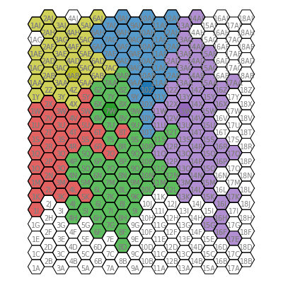
This map is actually "grown" using some simple rules from a few seed points. The animation of that growth process is what I want.
This isn't as clever as Conway's Game of Life, but it is similar in a few respects. Mine, for example, involves random numbers. Is that desirable? Can the dependency be reduced and still lead to complicated structures?
I want to tinker with the rules.
(I have a version running in the Pythonista environment on my iPad. I want a version in JupyterLab that I can expand on more easily.)
Let's compare and contrast the two approaches
Seductive and Wrong
This is seductive and simple. It fits (to an extent) with previous examples. It seems so right. And it sometimes works. But it's so wrong.
- Create 324 polygon outlines to paint the background grid.
- Create 324 text labels to label the hexes.
- As the generative algorithm runs, create colored polygon fill patches, showing how the 5 seed positions evolve into the 5 interlocking shapes. This starts with 5 filled polygons and grows to 200+ polygons through 48 generations. So that's \(35 + ... + 235 = 6,650\) filled polygons.
Wave after wave of increasing number of polygons. Sure, it's a lot of objects. I have a big laptop. We're good.
This has two problems.
- It's slow.
- If I save the animation as an HTML or JSHTML object, I get a cycling animation with the right number of images, but no content in any image.
- In spite of the animation being empty, the final image looks good.
- A few off-by-one errors.
What's wrong?
I'm patient and thorough. I tried a lot of things. I added Qt. I added ipympl. I restructured the animation as functions and callable objects. I used FuncAnimation and ArtistAnimation.
Nothing Worked. Nothing.
Spoiler Alert. That's how you know you're doing something fundamentally wrong. The thing works in general. But specific features are missing.
How Can That Be Wrong?
The foundational mis-understanding was trying to animate the appearance of various matplotlib Artist objects on the map.
I drew the grid. I drew the labels.
Then the colored hexes are supposed to appear, one at at time. I figured (wrongly) I would just draw the filled polygons.
See above. "Just about everything that happens in matplotlib depends on an abstraction called an Artist being out of date from the canvas."
Out-of-date?
Out-of-date!
State Change.
The Artist won't paint unless there's something new to paint.
On day three, I realized the truth.
It works like this:
- Create 324 polygon outlines to paint the background grid.
- Create 324 text labels to label the hexes.
- Create 324 polygons filled with white.
- As the generative algorithm runs, change the color in the polygon. Change the color. Change.
Change. The Artist is waiting for a change.
Don't create a wave of new polygons. Change the color of the polygons. It's simpler. It's faster. It works.
def paint(self, col: int, row: int, fill: str) -> None:
    """
    Update a hex's fill color.
    """
    for a in self.cells[col, row]:
        a.set(
            fill=True,
            color=fill
        )
Don't create a new polygon. Change the color of the polygon you have.
I still have no idea how the scale factors work when creating the JSHTML. I have eight mypy complaints because I'm not using matplotlib correctly. I have more work to do.
But. I have pictures that work. For the right reason.